
Kim’C Market is a Korean online grocery that delivers the finest quality food and ingredients from Korea to your door. This case study focuses on retaining customers and increasing conversion rate.
My Role
I’m analyzing the Kim’C Market website, tasked with improving customer retention, reducing cart abandonment, increasing conversion rate, and improving the general shopping experience.
Metrics and Research
Research Plan
Target audience: New users who were interested in purchasing Korean groceries, but did not purchase items.
Metrics: Time spent and actions performed on each page while building a cart, viewing the cart, and the checkout process.
🔑 After synthesis of metrics, I found a few key takeaways
People only like to buy certain Korean food
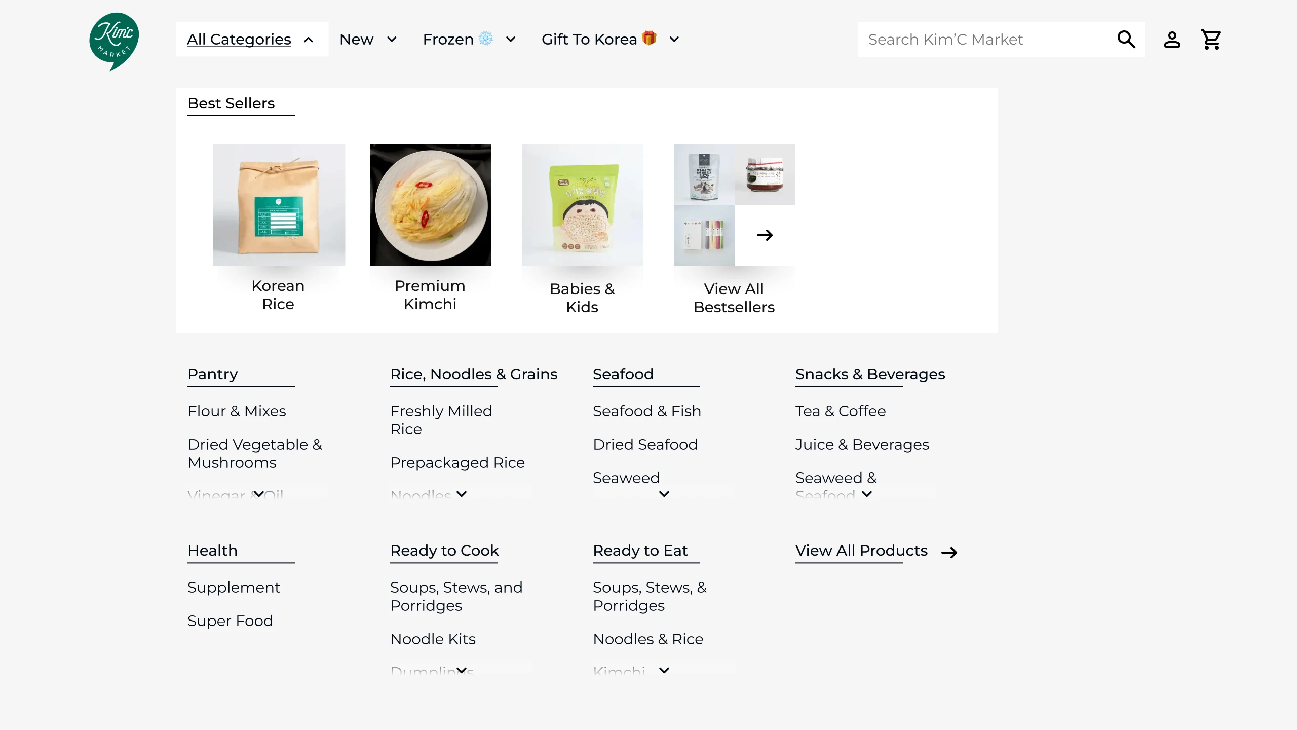
There is a large selection of food and other categories in the primary navigation, but 80% of them had no clicks.
Difficult to keep inventory of popular items
A lot of popular food items on the landing page are out of stock without having a quick way to set stock reminders.
Minimum order limit can be confusing if not done right
Food comes in two categories: regular and frozen. Each has a minimum order requirement, which can be a deterrent for customers.
Competitive Analysis
| Store \ Feature | Quick Categorization | “Notify me” for stock | Minimum order indicator | Discount for repeat orders | Gifting System |
|---|---|---|---|---|---|
| Kim’C Market | ❌ | ❌ | ❌ | ❌ | ✅ |
| Weee | ✅ | ✅ | ✅ | ✅ | ❌ |
| Unamicart | ✅ | ❌ | ✅ | ✅ | ✅ |
| asianfoodgrocer | ✅ | ❌ | ❌ | ❌ | ❌ |
| flybyjing | ✅ | ✅ | ✅ | ✅ | ✅ |
| bokksu | ✅ | ✅ | ✅ | ❌ | ✅ |
I conducted a feature inventory to identify how other grocery stores create lasting customer relationships. I examined the strategies they use to build impressions and foster loyalty.
Based on the insights, I explored how other niche grocery websites deal with categorization, inventory reminders, and minimum order limit.
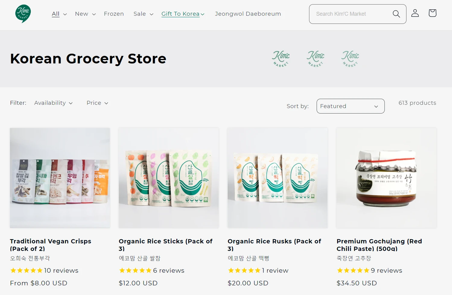
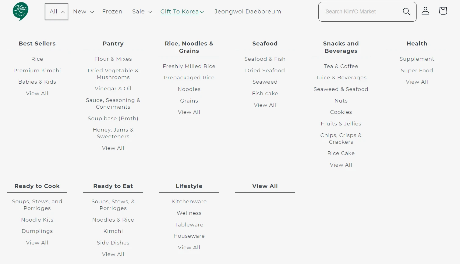
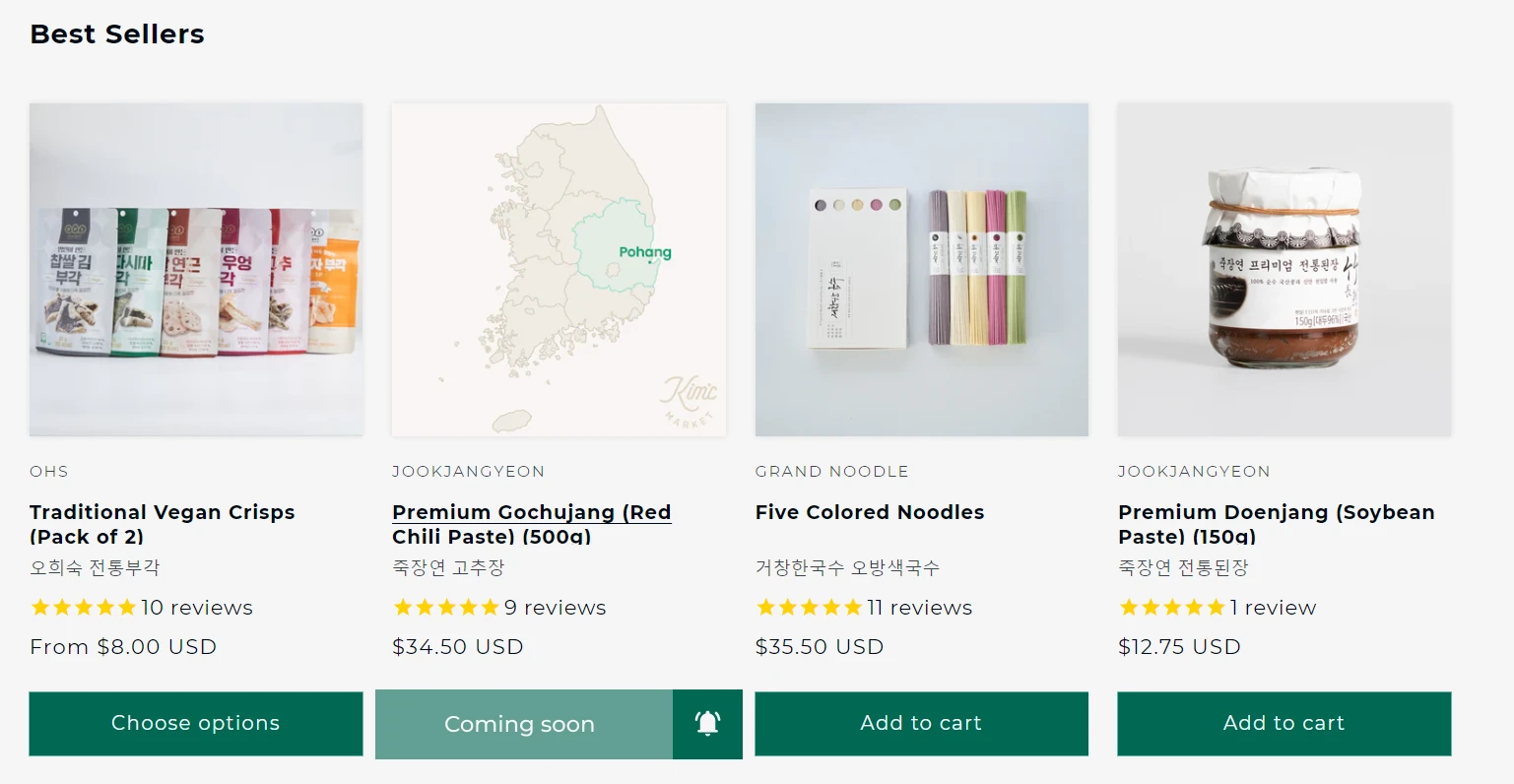
Drop-down Navigation
Existing Problem
The drop-down navigation includes a large list of items under the header "All". However, there are redundant labels that represent "View All", which can be confusing and lead to choice overload. For example, "Rice", "Freshly Milled Rice", and "Prepackaged Rice" all appear as separate options in the primary navigation.
Current Metrics
15% ⬇
People would choose to exit the website due to choice overload
40% ⬇
People would end up not making a choice after browsing
💡Solution
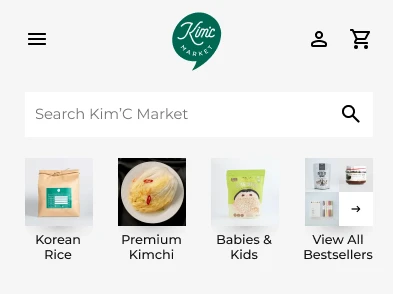
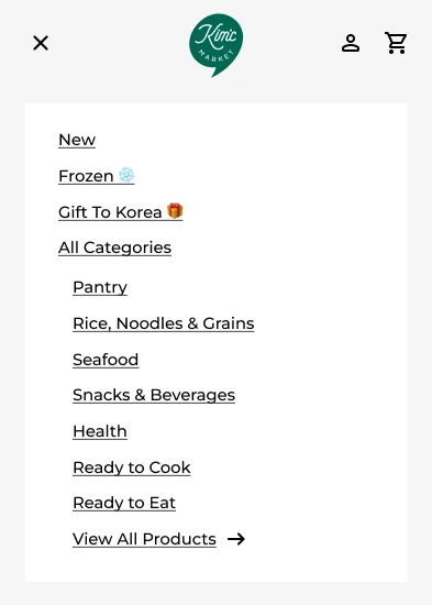
The improved best seller section, labels, and categories are also applicable to the mobile version of the website.
Improved Metrics
10% ⬆
Increased retention on the first stage due to clearer choices
40% ⬆
People would choose one of the top categories and proceed to the next section
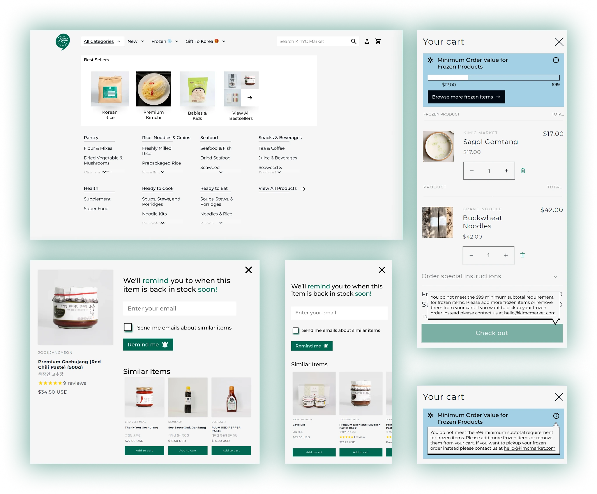
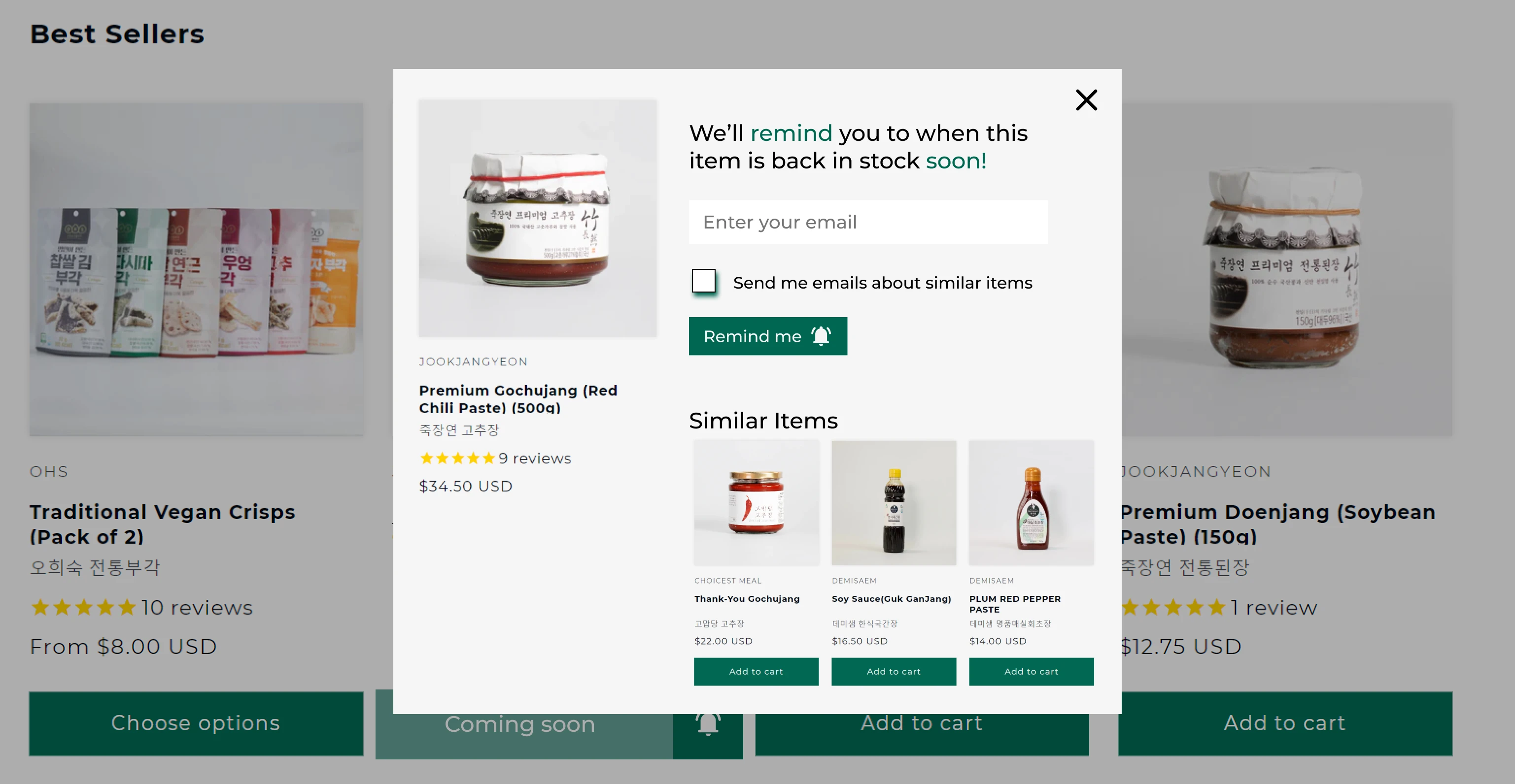
Inventory Reminders
Existing Problem
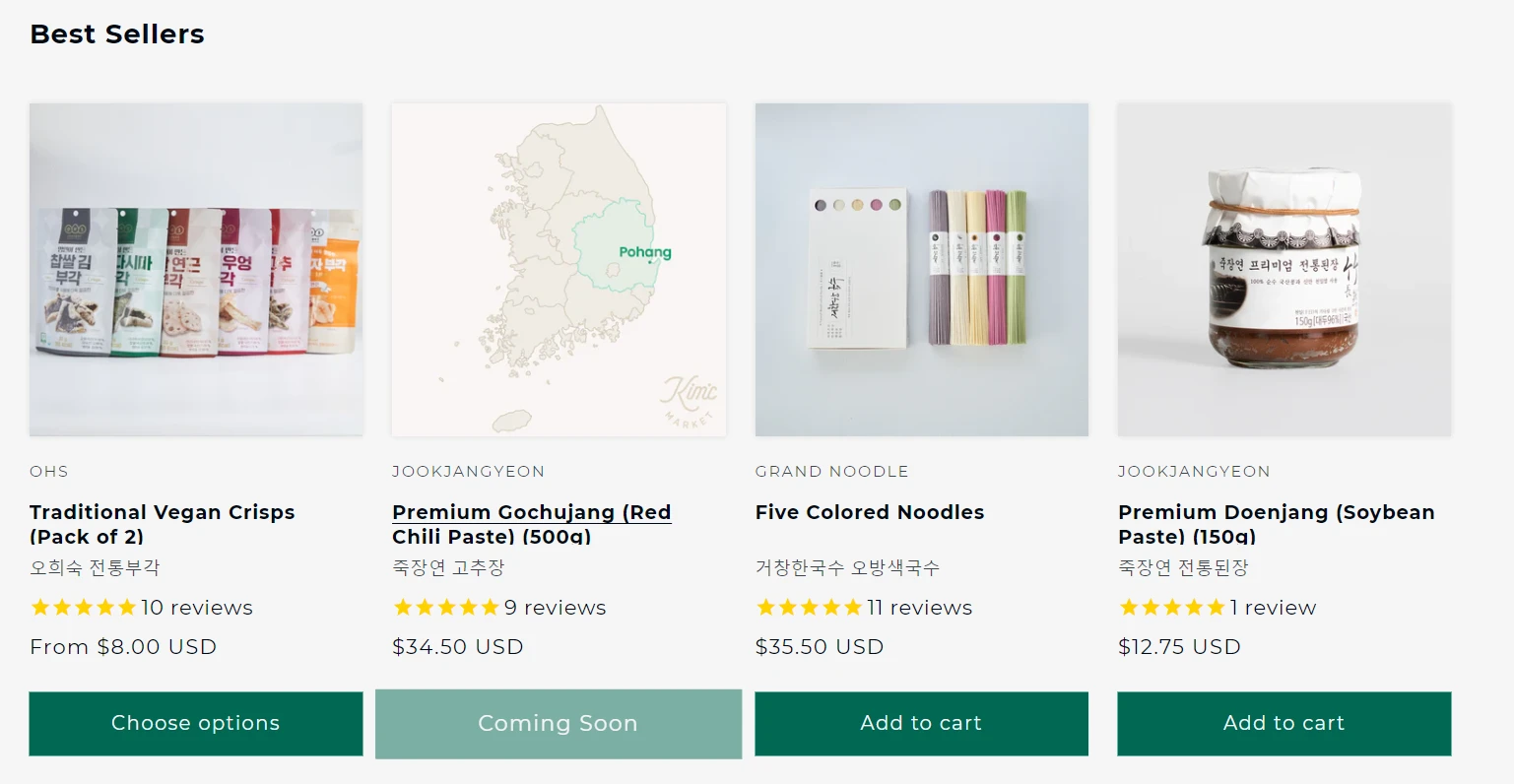
Out of stock items are prominently displayed on the first row of a subcategory which may drive user off a page, and doesn’t inspire confidence in them to find what they desire. Additionally, there is no quick way for a user to set restocking alerts.
Current Metrics
15% ⬇
People would lose confidence in finding their desired item if they immediately spot out of stock items
80% ⬇
People would never end up buying the product that was out of stock and forget to check back
💡Solution
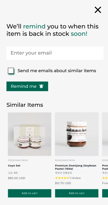
A similar modal applies to the mobile version of the website.
Improved Metrics
40% ⬆
People would lose choose an alternative option, or come back to buy the restocked product at a later date
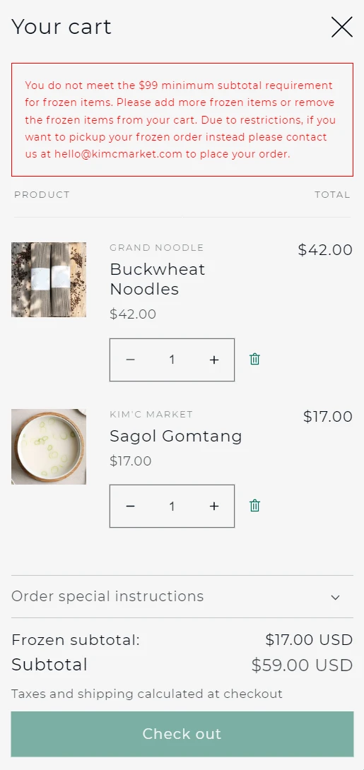
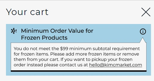
Minimum Order Limit
Existing Problem
Frozen items have a separate minimum order limit, and have no clear indication about the status. A long paragraph is displayed in the cart that explains the $99 minimum subtotal
Current Metrics
25% ⬇
People would end up abandoning the frozen cart, or the entire cart due to uncertainty about the minimum order limit
💡Solution
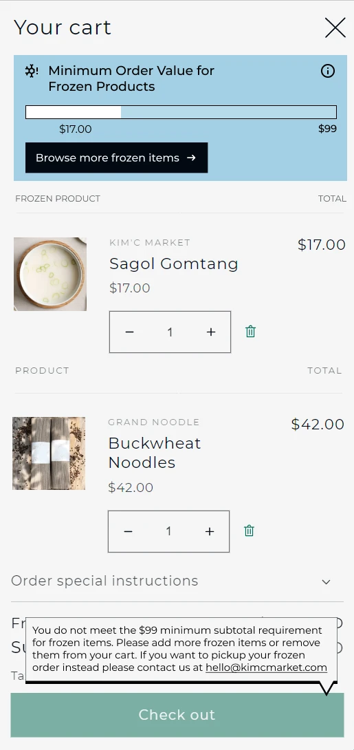
The same layout applies to the mobile version of this website
Improved Metrics
25% ⬆
People would end up completing the frozen cart order with quick access to the frozen section, and clearer visibility of system status
Conclusion
The redesign of Kim’C Market's website was a success: customers were more likely to complete orders and return to the site, and the conversion rate improved significantly. The improved user experience, combined with the new marketing strategies and other changes to the site, resulted in a higher cart fulfillment rate and increased customer retention. The success of this redesign demonstrates the value of investing in a comprehensive website design and marketing strategy.
10% ⬆
Increased retention on the first stage due to clearer choices
40% ⬆
People would lose choose an alternative option, or come back to buy the restocked product at a later date
40% ⬆
People would choose one of the top categories and proceed to the next section
25% ⬆
People would end up completing the frozen cart order with quick access to the frozen section, and clearer visibility of system status
Contact me for a conversation
Other Projects

AudioWalk
Audio Walkthrough for the Visually Impaired

XR Accessibility Design System
Accessibility focused design system for emerging technology

1Reality
1Reality is an Augmented Reality system for Emergency Medical Technicians, involving a Digital ID for patients