Problem
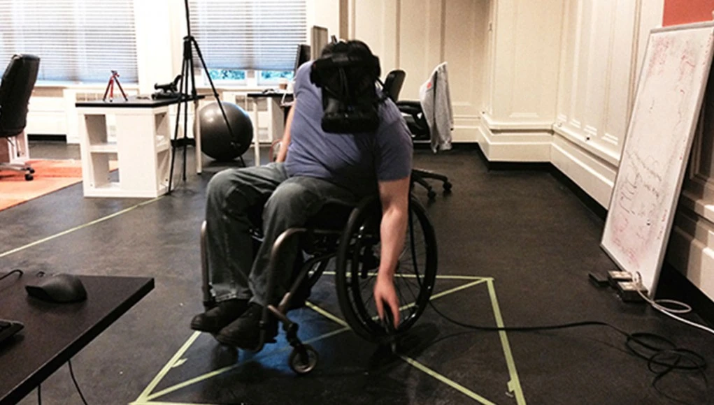
Interfaces used in XR are highly inspired from traditional 2D interfaces for introducing this new form factor, but are not ideal for this medium in the long run. The available 3D space is underutilized and users could benefit from a more spatial interface that is also optimized for accessibility.
I believe that the future of all interfaces is in XR. There is a need for the development of an interface that is innovative, easy, and possibly hands-free, while featuring alternative and accessible input methods.
Supporting Documents
Product Concept
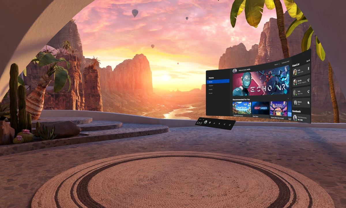
My project involves creating a design system for XR. The goal is to have a more spatial interface than traditional mobile interfaces.
The current interfaces don't accommodate users with disabilities. I believe this would make it easier for everyone to use, even users that are new to this ecosystem.
The focus is on how closed captions should be displayed or potential alternative methods for users with hearing impairments.
User Persona
A young to middle aged individual that is new to VR/AR but uses it on a regular basis. The user faces a motor function disability where they cannot move their head or arms freely, only in a limited range with some difficulty.
Why?
I believe that the future is XR. There is an eventual shift from flat screen mobile devices to technology that is easily accessible with hands-free, accessible input methods. I’d like to build a unified design system that is familiar, but also utilizes space in an intuitive manner without leaving users with disabilities behind. This would be a good standard to base OS and app interfaces for AR and VR headsets.

Business and User Needs
I interviewed the GM of Foretell Reality, for initial ideas. Foretell Reality is a part of The Glimpse Group, focusing on building a VR experience for improved mental health. Based on the short interview, I was able to find a client requirement involving closed captioning (cc) for VR.
Additionally, I got involved in the XR Access community where accessible XR interfaces are constantly being designed, discussed and tested, and they’re in need for prototyping and development of these ideas.
Positioning
There are several methods to position subtitles within a virtual space as demonstrated well in this user test: User Testing Subtitles for 360° Content - BBC R&D
- Evenly spaced around the user
- Fixed on screen attached to camera
- Following user with dampening
- Appears when idle
The methods involving following the user’s view were found to be ideal. Out of the two options, the one with dampening could be used but with a smaller value, such that there is still a delay before subtitles move to the center of the view, but that delay is very small. This avoids the complexity and distraction with fast head movements, but also makes sure “VR sickness” isn’t induced.
Oculus Guidelines
Oculus has some developer guidelines for VR accessibility design, including captions and subtitles. It gives suggestions for the font, location, speed, visual indicators, and colors.
To summarize:
- Sans-serif fonts are more legible since they are not as stylized
- OpenDyslexic, Arial, and Comic Sans are easier to read for people with dyslexia
- Give options for changing the distance of subtitle canvas
- Distant subtitles can make the use of speech bubbles
- Display words in unison with dialogue, and split them into blocks of 2-3 sentences
- Use visual indicators like arrows to direct users towards audio source
- Lighter font colors should be preferred since dark backgrounds are displayed more frequently, but it depends on content
- Consider having an outline or text background box to separate captions from the environment
Advice from a Deaf Person
Meryl Evans
One of the User Survey participants Meryl Evans is a disability advocate and has a lot of suggestions on making Virtual Reality and Closed Captioning better as she has a hearing disability.
- What It’s Like for a Deaf Person at a Captioned VR Presentation | Equal Entry
- Why Good Captioned Videos Are Important – Meryl.net home
To summarize her experience:
- It is hard to read transparent chats because of all the content behind them.
- Captions in other languages get automatically translated into the local language.
- People would clap, wave, love, and other actions via the emojis appearing above their heads.
- The captions are generated from automatic speech recognition (ASR). It makes sense to use automatic captions especially with all the conversations going on, but this system doesn’t recognize accents very well.
- Captions should follow Captioning Key‘s recommendation: “They need to be medium weight, be sans serif, have a drop or rim shadow, and be proportionally spaced.”
- The best captions are boring. Black and white work. They always have a strong contrast without distracting the viewer from the content.
- The other type of captions is the bullhorn. This appears somewhere on the scene rather than in a bubble.
- The recommended speed for captions is one to two lines at a time with up to 32 characters per line.
- Because of the bubble captions, you need to place yourself in a spot to read all captions and dart your eyes towards each user’s bubble, which may appear at the same time.
A lot more recommendations and a summary is present in her articles
- VR: Accessible Virtual Reality: Advice from a Deaf Person on How to Make It Better | Equal Entry
- General Captions: Why Good Captioned Videos Are Important – Meryl.net home
Myles de Bastion
Myles is a deaf visual artist who communicates through American Sign Language, and has built a VR captioning system based on that. He goes in depth about caption design and placement here: Myles de Bastion - Virtual Worlds Beyond Sound
To summarize,
- Captions are placed above the head for greater visibility when using American sign language, in order to not block either
- Captions are billboarded, and are oriented towards the user’s camera
- Off screen captions are displayed in the center of the screen
- Arrows can show directionality of off-screen audio
- Different colors or lines can also be used to indicate directionality
- Distant audio can have caption boxes with more transparency
Empathy Map

User Personas


To-do
After gathering feedback from experts on accessible captions in traditional and VR interfaces, there’s a set of guidelines to follow:
- Avoid motion sickness by avoiding a lot of movement
- Use pop-in captions as opposed to scrolling captions
- Follow accessibility guidelines for caption design
- Place captions as to not block important elements in the scene
- Caption important sounds that add value to the experience
- How does parallax impact viewing distance of text?
- A higher contrast is always preferred
- Off-screen captions can be placed in the center
- Try audiograms or haptics as alternative methods
- Caption length based on FOV and distance
- Text proportion scale based on distance
- Caption placement based on seating and standing positions
- Create experiments to test
- Shift focus to spatial interface
- Effort Impact Matrix
- Problem Impact Solution
Problem - Line Length
The recommended length is 32 characters per line for captions, but the FOV, distance and parallax can impact this length.
An in-depth case study recommends 20-40 characters per line which is dependent on the font, and needs adjustment for usage with captions.
Effort
This involves creating prototypes with different line lengths, with each example at a set of distances. Further, this would need a set of example sentences and paragraphs for testing with different fonts.
Impact
Line length greatly impacts readability and neck strain as the user moves their view. Another implication could be inaccessibility for users with motor function disability.
Effort-Impact Matrix

Caption Line length lies on the 2nd Quadrant, that is high impact and high effort
Problem - Audio Directionality
It’s difficult to perceive audio directionality through captions, especially ones that are off screen. The suggested method of placing off-screen captions on the center of the screen gives no context on where the audio is coming from, even if they’re colored to denote which character or person said it.
Effort
Solving audio directionality involves creating a “floating” caption solution which shows the directionality of audio with caption boxes. Since motion can induce sickness, the transition style, speed, and acceleration need to be optimized. This also needs user testing to make sure people don’t experience sickness.
Impact
Audio directionality is one of the most important aspects of immersion in VR, and is usually missed out with static captions. Solving it can let users with hearing impairments experience immersion closer to what a general user would
Effort-Impact Matrix

Audio Directionality lies on the 2nd Quadrant, that is high impact and high effort
Sketches
VR Homescreen
An accessibility optimized homescreen for VR
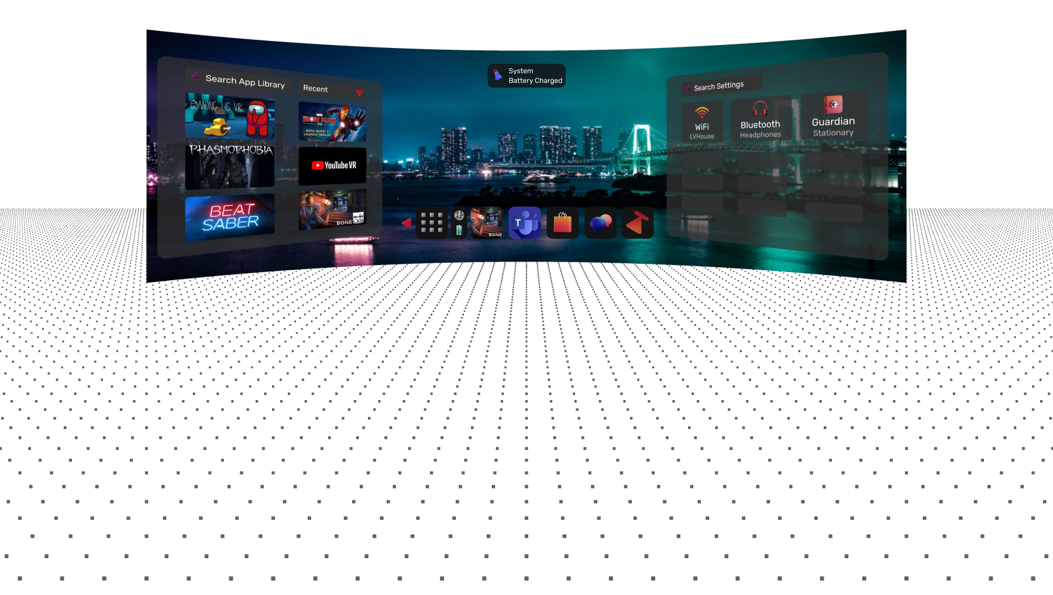
Taskbar
The taskbar is optimized to take advantage of depth, it shows sub-menus by hovering on an icon using controllers or gaze.
Task Switcher
A Task switcher that uses depth to overlay windows within the same app, it can be used for multitasking with an existing computer. A back button is displayed in the center to easily go back using controller or gaze trigger.
Directional Captions
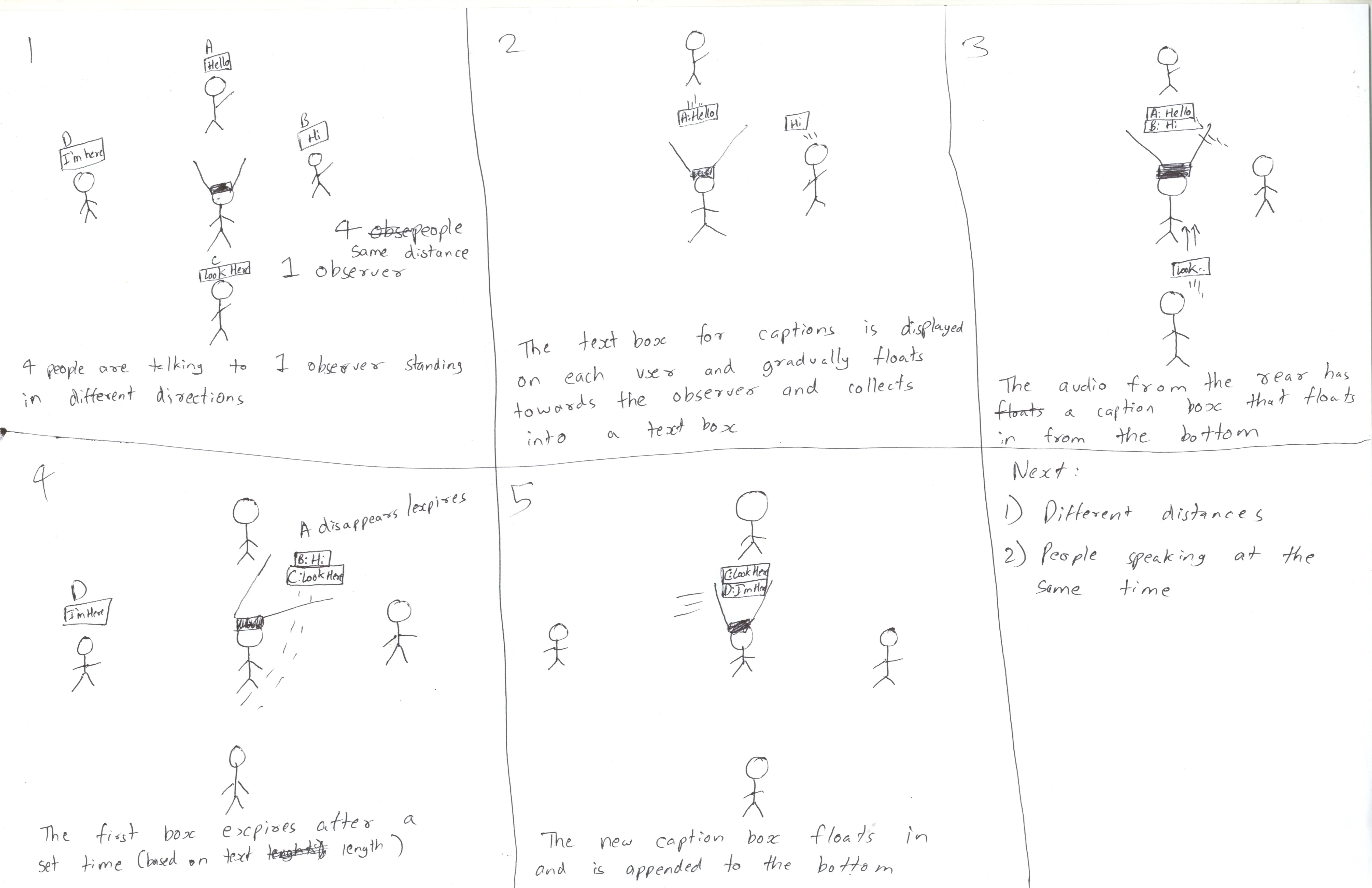
- 4 People are speaking to one observer standing in different directions- front, back and sides.
- The text box for captions gradually floats towards the observer and collects into a text box.
- The caption from the rear floats in from the bottom.
- The lines gradually fade away based on a dynamic duration.
- A new caption box in floats in and is appended to the bottom.
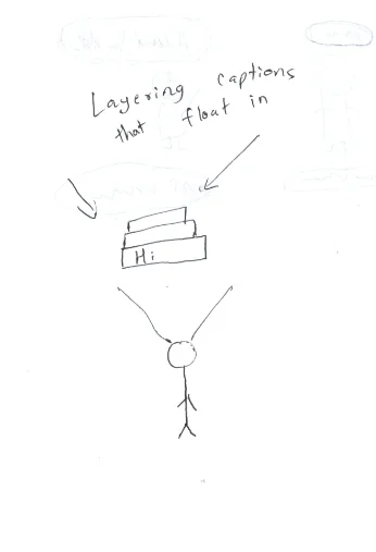
Layered Captions
A Similar concept with captions layered behind one another to reduce cognitive load while reading, since this also includes directional arrows with the caption.
Layered Captions with Reduced Motion
An option to reduce motion since some people may find the experience too distracting.
Foreground Captions / DND Mode
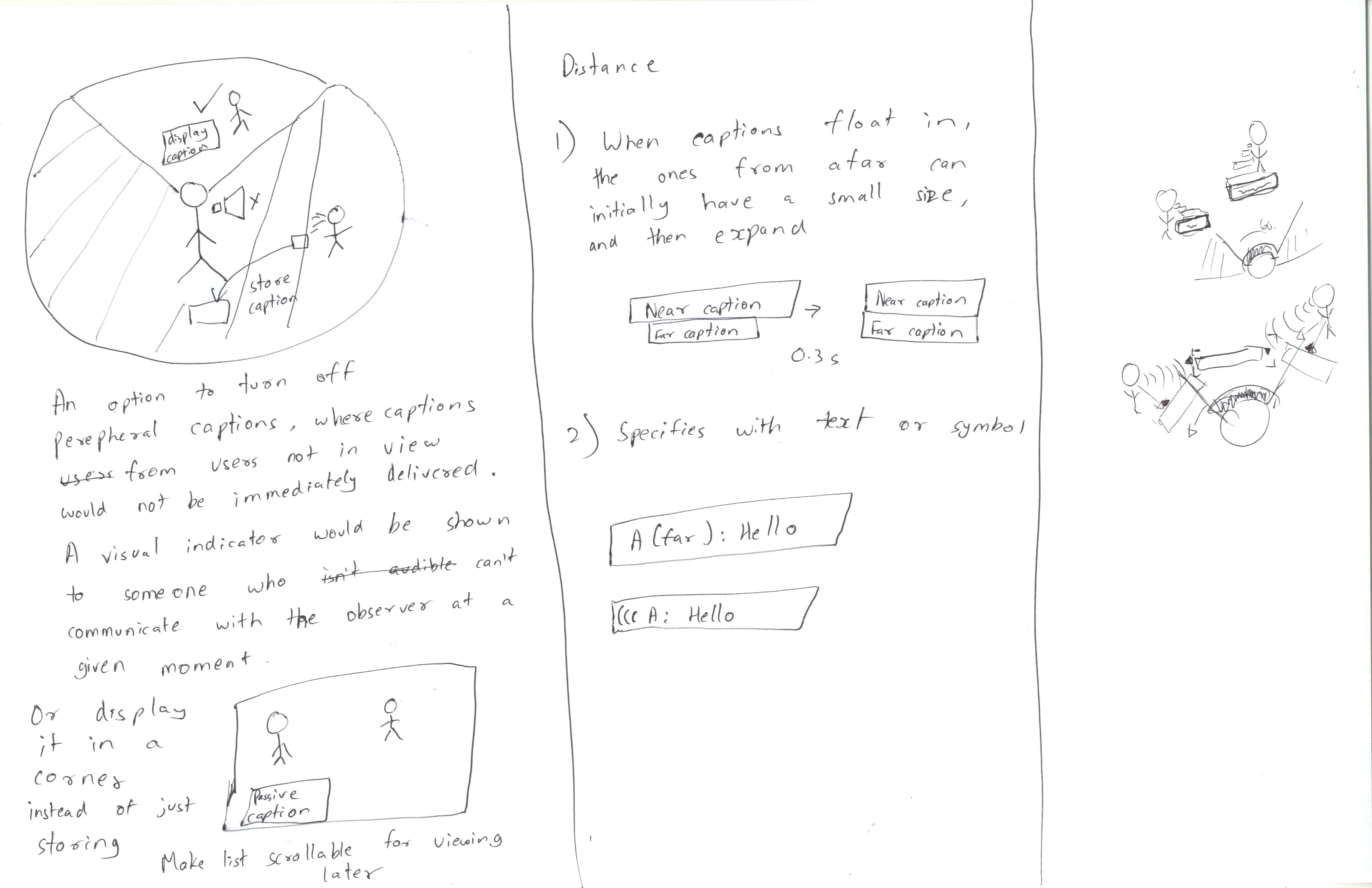
An option to turn off peripheral captions, where captions from audio sources not in the observer's view would not be immediately delivered. A visual indicator would be shown to such an audio source and captions will be collected in a chatbox in the corner of the view.
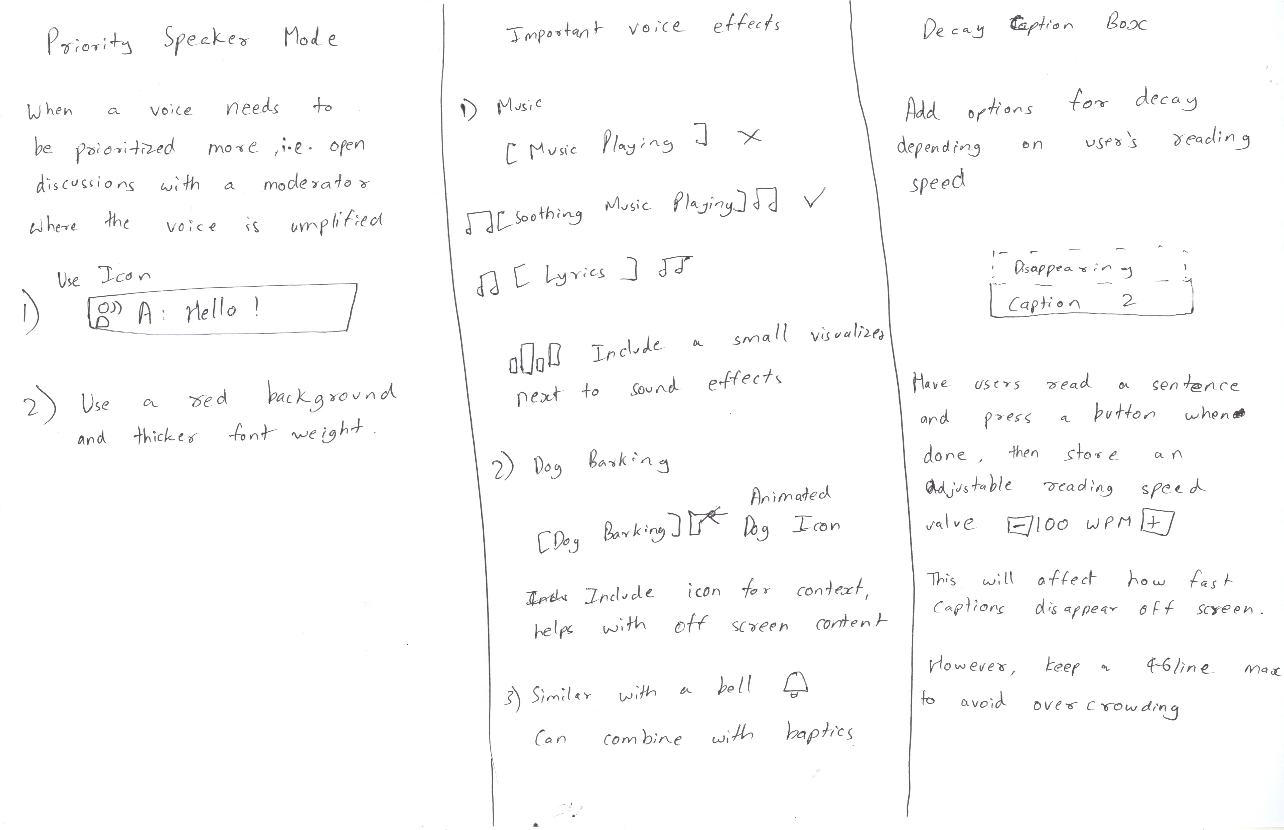
Description for Sound Effects in Caption Boxes
Important voice effects can show more context with icons and music visualizers.
Spatial Sound Effect Indicators
Off-screen spatial indicators for sound effects showing an icon and direction, split into two categories, natural sounds and alerts.
Reading Speed Calculation
- An onboarding process to calculate the users reading speed by asking them when to press a button when they finish reading.
- The value can be adjusted and used for caption decay, that is, how quick the caption disappears.
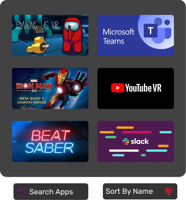
Quick Settings and App Library
The Settings menu was built to provide accessibility and important options at the bottom, to avoid hand strain and increase accessibility for users with motor function disabilities. The tiles were designed based on a redesigned information architecture

Typography

Design Library

A-Frame Demo
The VR Homescreen demo in A-Frame implements the new taskbar, and includes another accessibility improvement which brings apps and quick settings panels closer to the center, to help with neck strain or motor function disabilities.
The Directional captions demo in A-Frame implements the directional caption system, including a DND Mode for restricting background captions, and an option to reduce motion.
Experience in A-Frame (Try it out!)
Conclusion
It is clear that captions are required in almost all environments for hearing impairment. With options for every feature, it can be made more accessible to everyone.
While motion is helpful for conveying directionality for some people, it can induce sickness for others. Some people like colored tags and arrows, while other people like a very simple caption box.
Instead of striking a balance with one system, there is something available for everyone.
References
- Does WAI-ARIA even work with WebXR? | Equal Entry
- Interacting with Objects in an Inclusive Virtual Environment | Equal Entry
- Can You Identify Which Color Combination has the Greatest Contrast? | Equal Entry
- Thoughts on Accessibility Issues with VR
- Captioning Key - Text
- User Testing Subtitles for 360° Content
- 10 Rules of Using Fonts in Virtual Reality
- Captioning Key - Text
- Accessible Virtual Reality: Advice from a Deaf Person on How to Make It Better
- Why Good Captioned Videos Are Important - Meryl.net home
- Myles de Bastion - Virtual Worlds Beyond Sound
- Icons
Contact me for a conversation

Kim'C Market Redesign
Transforming the online grocery experience through exceptional user engagement

1Reality
1Reality is an Augmented Reality system for Emergency Medical Technicians, involving a Digital ID for patients

BridgedXR
BridgedXR is Assistive learning for aiding people with learning disabilities, using Geography as a teaching subject in Mixed Reality
